
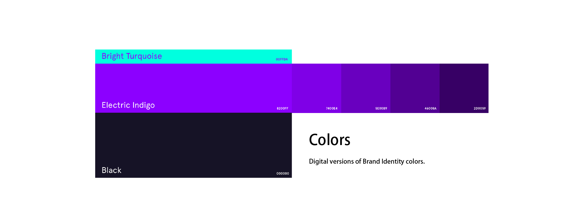
配色還原品牌原本的氣質
凸顯科技感和數字感,以electric indigo為基準,向上引入明亮的bright turquoise色調,搭配出撞色設計效果。使得品牌時尚大方,接近年輕人的富有的精力充沛和創意無限的品牌氣質。在輔助色上,使用黑白配色,凸顯科技感和穩重感,同時,營造整體感和帶入感。
Highlights the technological and digital senses, based on eclectic indigo, which introduces a brightbright turquaise to the top, with the impact of a knockout design. Makes a big brand of fashion, close to young people’s energetic and creative branding. On the side colour, use black and white colours to highlight the technical and stability sense, and at the same time, to create a whole and bring in.
凸顯鏈接.掌控品牌的力量
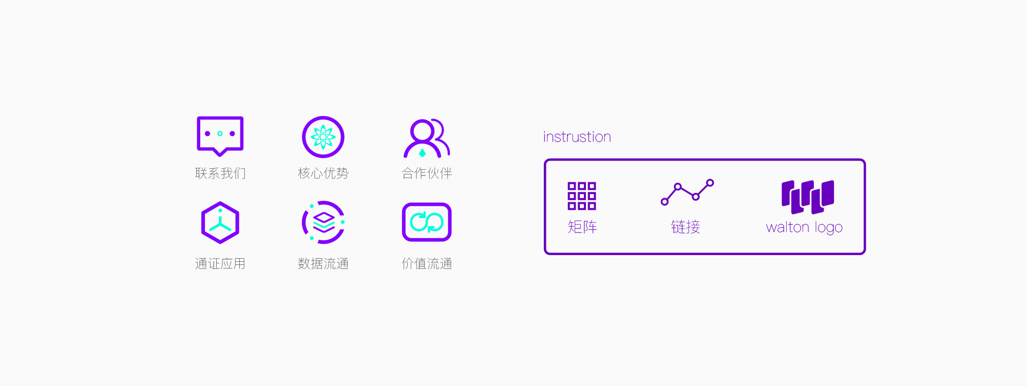
在確認了配色之後,維仆團隊精心設計了頁面裏所需要的任何一個icon。第一,在icon結構上,充分表現品牌產品的屬性,即鏈接;第二,在配色上,充分使用對撞色,營造時尚氛圍和超前的科技感觀;第三,對於關鍵icons,使用svg animation進行動畫演繹,在交互上,通過小動畫形式,充分展示品牌感,傳達品牌定位,同時大幅增加頁面靈動感。
After identifying the color, the maintenance team carefully designed any of the icon needed on the page. First, in the icon structure, the attributes of the brand product, i.e., the link, are fully demonstrated; second, on the color, the match color is fully used, the fashion atmosphere is constructed and the technology perception is advanced; and third, for key icons, the svg animation is used in the action drawings, and interactively, the brand sense is fully displayed through small animations, and brand positioning is disseminated, with a significant increase in the productivity of the page at the same time.
如何進入網站更酷--頁面載入動畫
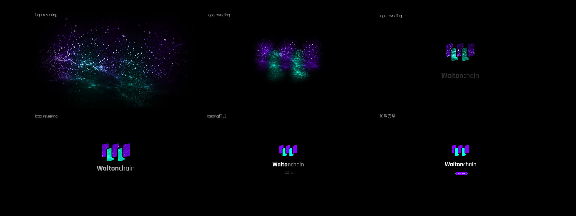
為了營造整體感,維仆團隊充分利用waltonchain品牌所給予的想象空間,使用html5 canvas技術,為其打造了2款logo revealing,便於訪問者在等待加載的3~5秒內,能夠有一種賞心悅目的體驗,以下是其中一版。維仆團隊,充分利用了canvas性能空間,使用particles、 blur、zoom-in 等方式,在網頁中實現影視後期版的加載效果。
In order to create the whole feeling, the servants, making full use of the imaginary space given by the waltonchain brand, using the html5 canvas technique, created two logo readings for them, so that the interviewers can have a pleasant experience within three to five seconds of the load, one of which is the following. The servants, making full use of the Canvas performance space, realized the added effect of the post-record version on the web page, using, inter alia, partyes, blur, zoom-in.
讓頁面靈動起來--通過svg動畫增加細節動感
svg的好處在於它們的矢量性質,無論動畫在什麽樣的設備上,都能夠清晰的呈現出來。svg動畫完全通過代碼來書寫元素運動和動畫軌跡方式,使得任何一個svg動畫體積都非常小,而且兼容性極佳。維仆團隊在waltonchain頁面中大量采用svg動畫,來說明和展現waltonchain如何在區塊鏈技術技術進行突破。告別枯燥的數據和數碼,通過動畫的形式,引人入勝。
The benefits of svg are in their vector quality, and no matter what the animated device is, it can be clearly presented. Svg animations are entirely coded to write the movement of elements and animated tracks, making any svg animation very small and compatible. The waffle team uses svg animations on the waltonchai page to show and demonstrate how waltonchai is able to break through the chain technology.

3D引擎的應用--使用webgl技術增添光彩
網站首頁整體采用豎排滾動講解方式,告別傳統網站的展示方式。維仆團隊為waltonchain引入了html5前言技術,即webgl技術,在canvas中繪製3d場景,以實現頁面的縱深感和動態感。配合內容的講解和酷炫的交互方式,通過短短5屏內容,將waltonchain的業務進行全方位的講解。在感官和信息獲取上實現了高度的平衡。
The headlines of the site as a whole are presented in a twig-roll-and-roll-and-speech format. The waltonchain team introduced html5 foreword technology, Webgl technology, to create 3d scenes in the canvas to show a deep and moving sense of ownership of the page. Concluded with the content's presentation and cool interactive approach, the waltonchain's business is presented in a full-scale manner through five screens. A high degree of balance is achieved in sense and information capture.
頁面風格的延伸
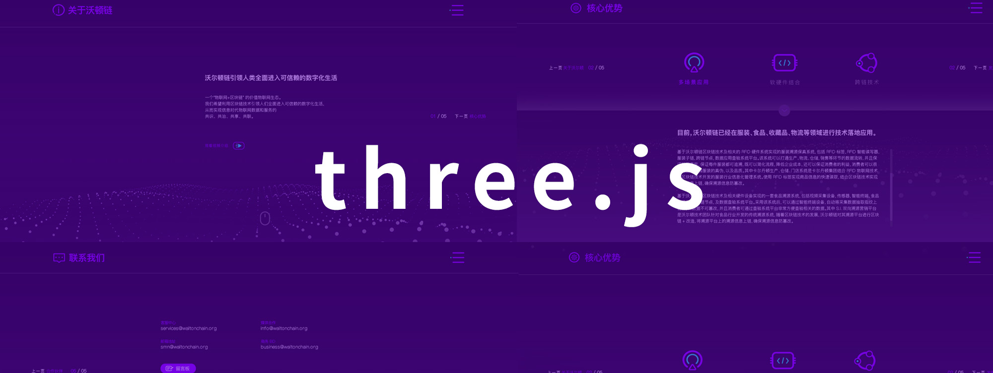
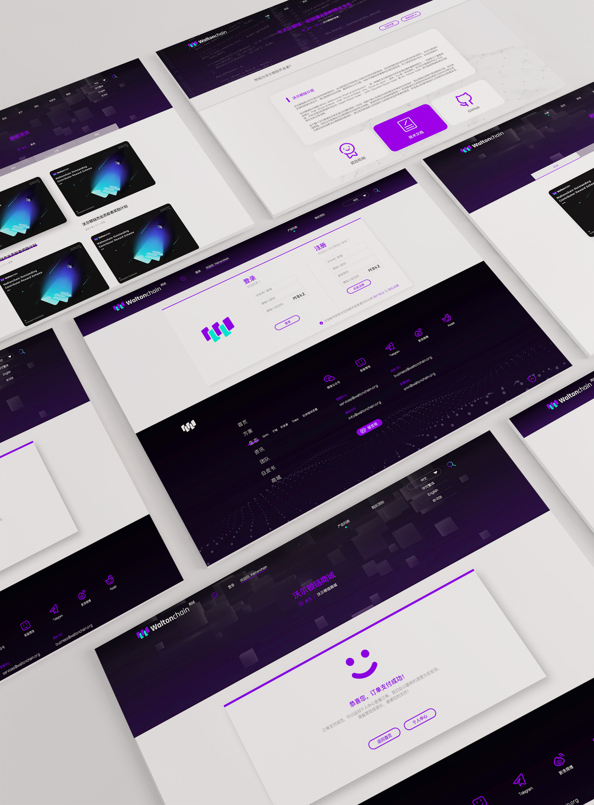
從首頁到內頁的延伸上,維仆團隊堅持品牌調性和風格,統一視覺風格和交互語言。由於walton內頁內容較為煩躁。故沒有采用更多復雜的交互動畫,轉而采用更加直接的方式,用一種優雅的設計語言進行簡約大方的展示。
From the beginning of the home page to the end of the home page, the maintenance team insists on branding and style, and on a single visual style and interactive language. As the content on the walton page is more irritated, there is no more complex interactive animation than a more direct presentation in an elegant design language.
如何把互聯網基因充分展現出來
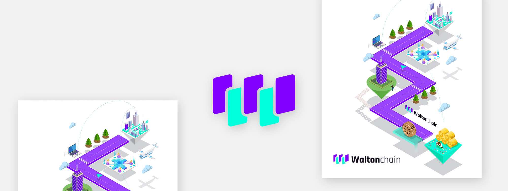
waltonchain專註於區塊鏈硬件和軟件的研發和落地。其本身具備的是一種擁有很深互聯網烙印的極客精神企業。團隊年輕、富有前瞻思維,在品宣上,我們的設計團隊充分把握這一點去放大和表達。
waltonchain focuses on the development and landing of chain hardware and software. It's built on a deep network-marked extremist spiritual enterprise. The team is young, forward-thinking, and our design team fully grasps this to zoom in and express itself.
不同語言版本看起來都很不錯
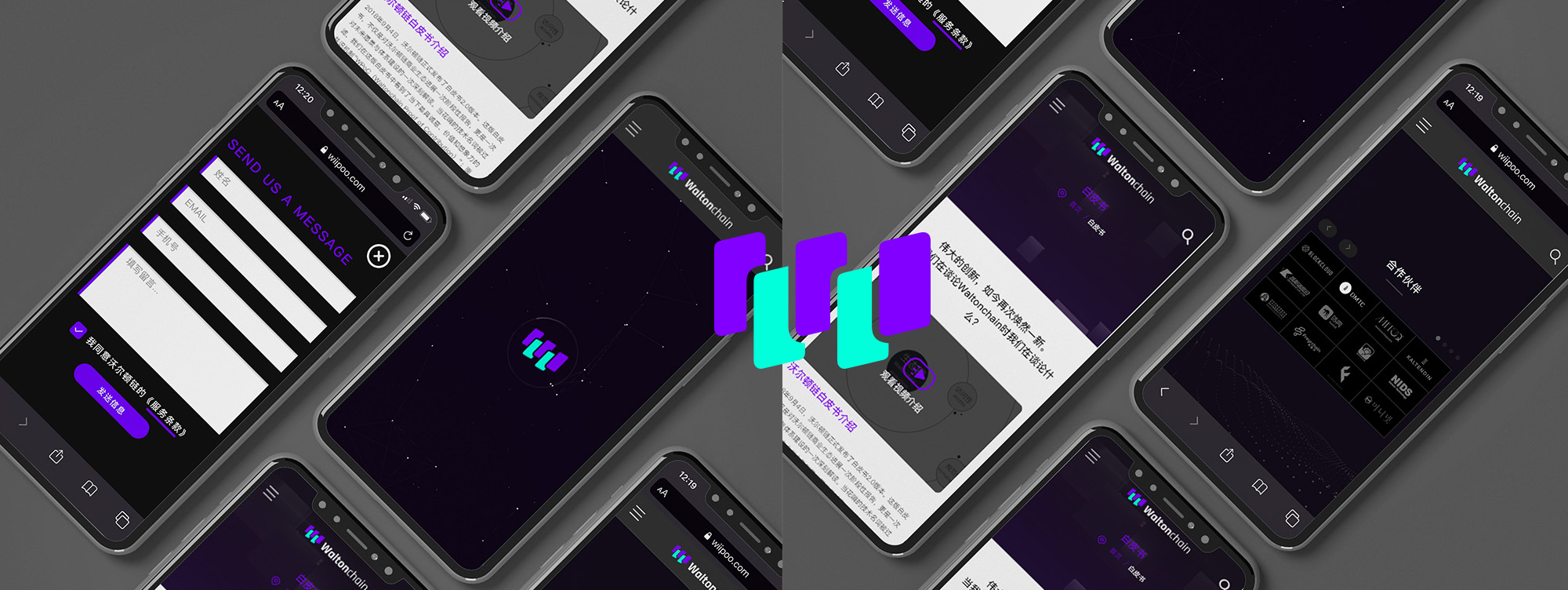
維仆為waltonchain設計和開發了4個文字版本,每個文字由於其字體結構不同,在設計開發之初,我們花費了一部分精力,研究如何使得改文字地區的用戶能夠適應我們的語法和書寫規範。對於字號大小、字體顏色、標題正文等對比關系的把握,維仆在策劃之初,都全盤進行了考量。
The Veterans designed and developed four text versions for waltonchain, each of which is based on its typographical structure. At the start of the design, we spent part of our energy on how to adapt the users of the typographical areas to our grammar and writing rules. For control of the correlations between the size of the word, the color of the word, the headlines, etc., the masters took full consideration at the beginning of the project.

多個設備都很出色
從pc到Mac到移動端,各個設備我們都進行了精心的適配工作。保證waltonchain在全球的用戶都能夠隨時隨地的愉悅的進行網站訪問和義務咨詢。
From pc to Mac to the migration end, we've done a lot of tailor-made work in each of the facilities. waltonchain users around the world are assured that they will be able to visit and consult around the world at any time and with pleasure.
精心設計的菜單交互
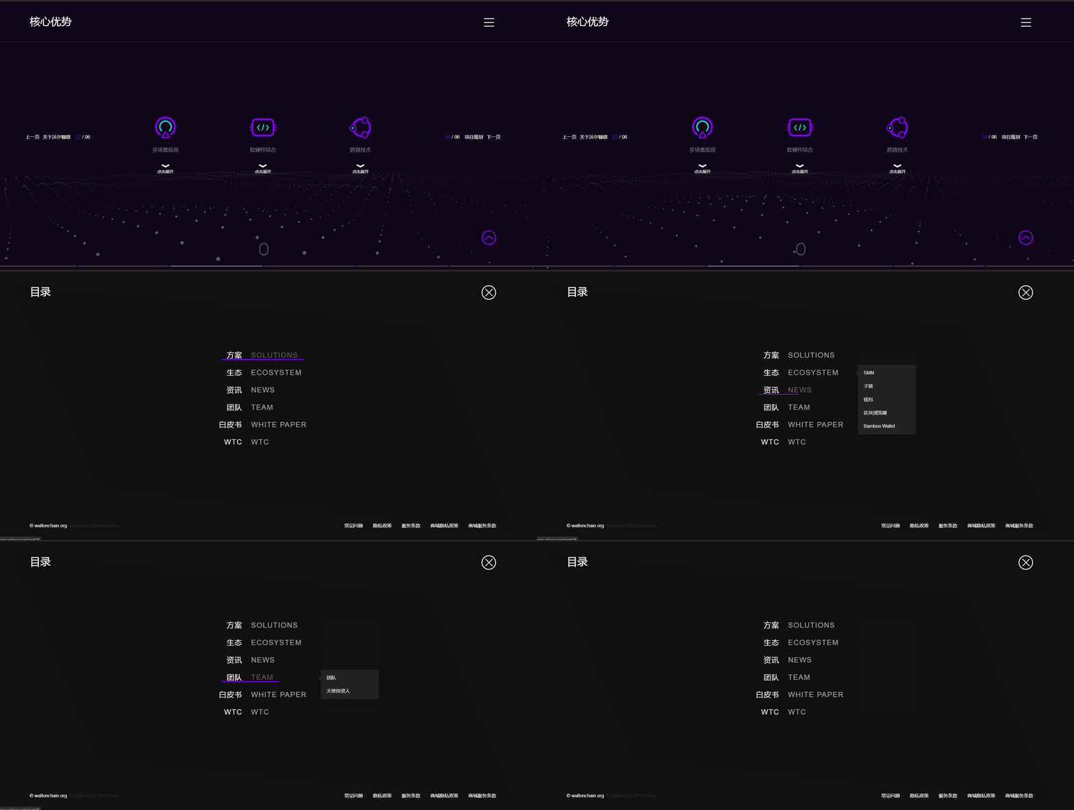
相比於普通的展現方式,維仆團隊經過研發,充分利用css3效果,使得菜單也富有縱深感,我們希望通過這一些細節的設計,讓訪問者能夠更加方便快捷並不失愉悅地訪問waltonchain,能夠從數字化的維度全方位的了解這個品牌,從而促進品牌的紮根和傳播。
Compared to the ordinary way of showing, the Veterans have developed and made full use of the css3 effect, making the menu more powerful, and we hope that some of these details will make it easier for visitors to visit waltonchain more quickly and without gloom, to understand the brand in all its dimensions from the digital dimension, and to promote its roots and dissemination.
注册有任何问题请添加 微信:MVIP619 拉你进入群

打开微信扫一扫
添加客服
进入交流群









发表评论