Web3.0的概念正在向人们生活逼近,而当这一概念被应用于产品设计、并影响到实际的用户体验时,设计人员应该如何做好用户体验设计?在交互上,设计人员又可能遇到哪些问题?本篇文章里,作者就对Web3.0时代的用户体验设计框架进行了总结,一起来看看吧!
The Web3.0 concept is moving towards people’s lives, and when it is applied to product design and affects actual user experiences, how do designers design their user experience? What problems do designers encounter on their interactions? In this article, the authors summarize the design framework of the Web3.0 era’s user experience.

有很多新元素将web3与web2区分开来,例如:汽油费、代币、钱包和智能合约,我们需要考虑的不仅仅是 UI设计,还有更多内容。我们需要提高所有内容,以创造良好的用户体验。
There are many new elements that separate web3 from web2: gasoline, tokens, wallets and smart contracts , and we need to consider more than just UI design. we need to improve all content to create good user experience.


如何可视化 Web3中UX的不同层
思考一个标准的应用程序,没有 Web3,只是在您经常使用的智能手机上的一个热门应用程序:这个应用程序的实际用户界面只是从现实世界开始的一长串体验中的最后一个元素,穿过无数物理空间,进入数字交互,穿过一大堆不同的硬件和软件,直到你最终发现自己悬停在你的拇指上在某人设计的按钮上。
Think of a standard application, no Web3, but a popular application on your often-used smartphone: the actual user interface for this application is just the last element in a long series of experiences from the real world ,
您可能有一个想法,例如“播放音乐”或“查看路线”或“买衣服”,这是由您的物理环境中的某些东西引起的。
You may have an idea, such as "play music" or "see route" or "buy clothes", which is caused by something in your physical environment.
这种方式的“用户体验”早在你从口袋里拿出手机之前就已经开始了。
The "user experience" of this kind started long before you took your cell phone out of your pocket.
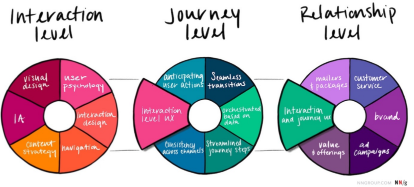
Nielsen-Norman 模型具有三个层次:
The Nielsen-Norman model has three layers:
- 交互级别;
- 旅程级别;
- 关系级别。


这三者共同涵盖了从现实世界到数字世界的整个用户体验。该框架经常用于CX设计(客户体验)和服务设计。在大多数情况下,一个人甚至在访问您的应用程序或网站之前就已经做出了许多决定。
The framework is often used for CX design (customer experience) and service design. In most cases, a person has made a lot of decisions even before accessing your application or website.
“如果我问人们他们想要什么,他们会说更快的马。”
"If I ask people what they want, they'll say faster horses."
人们真正想要的是“更快地到达目的地”。这可以通过汽车来解决。但这种解决方案只有在提高认识、创建更好的道路生态系统、彻底改革整个制造业并通过适当的法律后才能真正起飞。
What people really want is to get to the destination faster. This can be done by car. But this solution can only take off if it raises awareness, creates better road ecosystems, overhauls the entire manufacturing industry and adopts appropriate laws.
汽车的最终设计显然也很重要,但要让这种新的交通方式像它最终那样成功,每个人都需要得到好处,而且大量的基础设施、流程、法规和相关技术必须也有待改进。
The ultimate design of automobiles is obviously also important, but for this new mode of transport to succeed as it ultimately does, everyone needs to benefit, and a great deal of infrastructure, processes, regulations and related technology needs to be improved.
如果我们看看像Netflix这样更现代的东西,我们可以再次看到体验的多个层次:
If we look at something more modern like Netflix, we can see the multiple levels of experience again: .
核心用户故事类似于“人们想要高质量的娱乐”。该问题的解决方案最初是 DVD,但现在解决方案是数字流媒体平台。
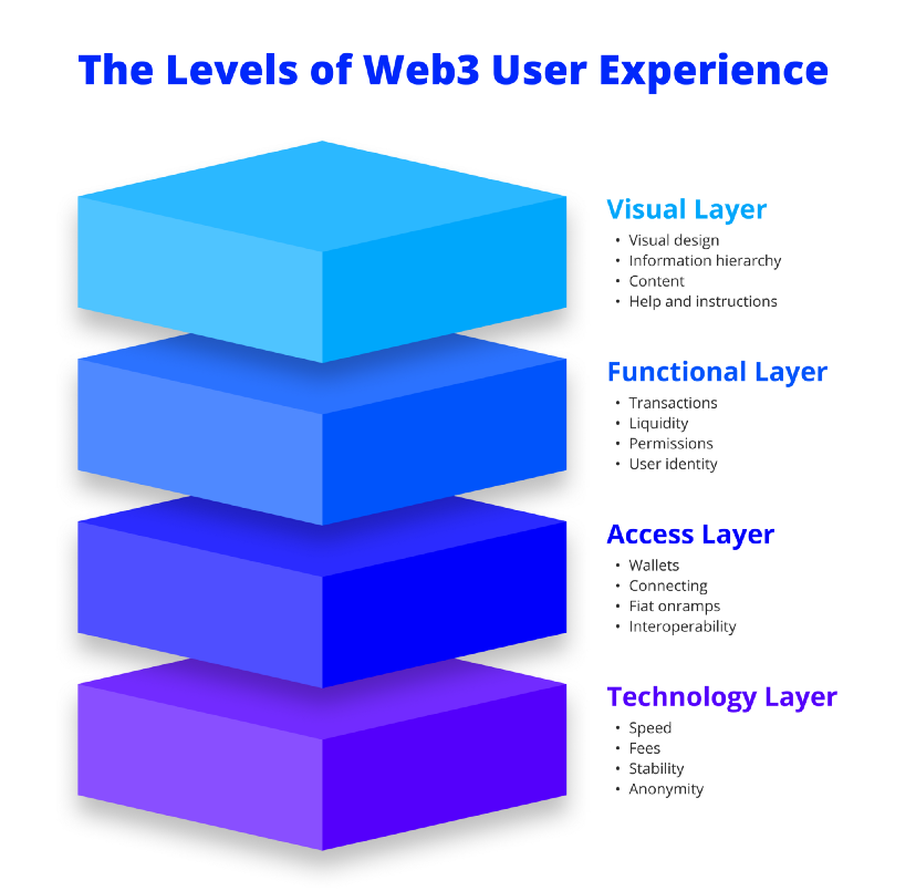
The 这需要专家的委托和策划。用户还希望看到高清视频,这需要Netflix端的良好压缩和用户端的良好互联网连接。他们想找到自己喜欢的东西,这需要良好的 UI、出色的信息架构和巧妙的推荐算法。 This requires expert commissioning and planning. Users also want to see high-quality videos, which require good compression on Netflix and good Internet connectivity on the user side. They want to find what they like, which requires good UIs, excellent information structures and smart recommended algorithms. 在这两种情况下,“用户体验”所包含的内容比您想象的要多得多。 In both cases, the "user experience" contains much more than you think. 对于 web3,用户体验设计有四个不同的层次。 For web3, there are four different levels of user experience design. 一个简单的框架,用于可视化要处理的不同层 我们看到这些层堆叠在一起,底层是最重要的,但也是最难影响的,因为它与所使用的任何区块链的技术限制最相关。顶层是可视层,可以很容易地修改它——当然你放在那里的东西完全取决于它下面的层。 We see these layers stacked together, and the bottom is the most important, but also the hardest, because it is most relevant to the technical limitations of any block chain used. The top layer of the is a visual layer that can be easily modified -- of course, what you put there depends entirely on the floor below it. 以下是每一层中存在的一些具体挑战,从下到上: The following are some of the specific challenges in each layer, from the bottom to the top: 1)技术层 1) Technical layer 2)接入层 2) Access level 3)功能层 3) Function Layer 4)视觉层 4) Visual layer 目前实际的技术层在用户体验设计方面已经做的很好了。在国际上发送大笔付款通常需要等待时间、费用,在某些情况下,还需要与中间银行进行安全检查。也很难追踪。在区块链上,它可以快速、廉价地发送(但并不总是),并且可以被任何人验证。 The actual technological layer of is now doing well in the design of the user experience.
这个级别的用户体验挑战是: The user experience challenge at this level is: 这些是需要解决的一些最大挑战。然而,它们与界面无关。有鉴于此,第2层区块链是改善整体用户体验的直接尝试。 These are some of the biggest challenges that need to be addressed. However, they have nothing to do with interfaces. With this in mind, the second-tier block chain is a direct attempt to improve the overall user experience. 当您考虑像链上身份这样的非定义的东西时,这种事情变得更加重要。如果有一天我们要使用自托管钱包登录服务并将我们的数据从web2公司手中保护出来,那么我们真的非常需要快速和安全的网络。 This is all the more important when you think about non-defined things like identity on the chain. If one day we use our own wallet login service and protect our data from Web2, we really need a fast and secure network. 想象是1995年,您正在听说这个奇妙的新事物,称为互联网。首先,您需要一台带调制解调器的PC,并且需要将其连接到电话线。一旦您“拨号”到“网上冲浪”,您将无法接听电话。要真正做事,你必须设置一个“电子邮件地址”,可能是“pop3”或“imap”,使用“浏览器”,如果你想成为专业人士,了解“telnet”和“ftp”。无论如何,你无论如何都会管理它,事情将永远不会再一样了。 imagines 1995 when you are hearing about this wonderful new thing called the Internet. first, you need a PC with a modem, and you need to connect it to the telephone line. Once you dial it to surf online, you will not be able to answer the phone. To do it really, you must set up an “e-mail address”, possibly a “pop3” or “imap”, using a “browser” if you want to become a professional, know “telnet” and “ftp”. In any case, you will manage it, and things will never be the same again. 这个级别的用户体验挑战是: The user experience challenge at this level is: 当我们谈论 web3 UX 时我们在谈论什么。要考虑的一件事是,其中一些东西一定很奇怪,因为它也是全新的。新功能似乎总是很难开始。几年前,没有人听说过 NFT 或 AMM。现在我们有了它们,我们需要弄清楚如何最好地使用它们。 What we're talking about when we talk about web3 UX. One thing that's going to be considered by 这个级别的用户体验挑战是: The user experience challenge at this level is: 此级别的一个重要说明是,其中许多问题已通过一些托管加密应用程序部分解决。不利的一面是,在大多数情况下,你是在用一些去中心化来换取更好的用户体验。 An important note at this level is that many of these problems have been partially resolved by hosting encryption applications. On the negative side, in most cases, you are using some decentralisation for better user experience. 你所看到并试图理解的:我们是否基于用户研究使用一致的设计模式?术语是否过于技术化?在手机上看起来一切正常吗? What you see and try to understand: do we use consistent design models based on user research? Are the terms
这个级别的用户体验挑战是: The user experience challenge at this level is: “所有模型都是错误的,但有些模型是有用的”。 “All models are wrong, but some are useful”. 这是设计师乔恩·克拉布尝试为 Web3 UX 创建一个更大的框架,随着时间的推移设计师还会继续构建。设计师希望它能鼓励交互设计的行业,并引起大家对Web3.0 UX的讨论。 This is 它可能并不完美,但我们可以共同测试与完善:) It may not be perfect, but we can test and refine it together: 作者:交互设计小助手;公众号:美国交互设计资讯 Author: Interactive Design Assistant; Public Number: United States Interactive Design Information 原文链接:https://mp.weixin.qq.com/s/jgiDe_Vjh16iIydHxEMQtQ Source: https://mp.weixin.qq.com/s/jgide_Vjh16iIydHxEMQ 本文由 @美国交互设计资讯 授权发布于人人都是产品经理,未经作者许可,禁止转载 This post is published by @U.S. Interactive Design Information and is authorized by everyone who is a product manager and is prohibited from reproducing it without the author's permission. 题图来自 Unsplash,基于 CC0 协议 The title is from Unsplash, based on the CC0 protocol.

注册有任何问题请添加 微信:MVIP619 拉你进入群

打开微信扫一扫
添加客服
进入交流群


发表评论